Published 11/05/2023
Recently, Bridgeman Images was pleased to sit down with Tim Green, Creative Director of Faceout Studio, a market leading design firm, specializing in books. Tim shares his insights into working on special projects to working with a wide range of clients from various publishing sectors.
Below, Tim shares his creative process and dives deeper into the inspiration for a few of his recent projects which used Bridgeman Images content in a new, imaginative way.
What was your path to becoming a book cover designer?
TG: Well, it’s kind of a winding path as I’m sure it is for many. I loved to draw as a kid and that has been with me as long as I can remember. I always found myself drawing Spiderman, The Teenage Mutant Ninja Turtles, or a Pepsi can.
My artistic interest definitely took on the flavor of graphic design from a young age, before I knew that was a thing. When I discovered that it was a somewhat reputable profession, I was all in. After college I went to a cousin’s wedding and got bumped off a flight and was given a comp ticket which I then used to go to New York to try to find work there. It didn’t pan out, but that process taught me a lot. Afterwards, a friend in publishing put me in contact with the team here at Faceout Studio in Central Oregon, and now I am in my own neck of the woods, and well, that’s where I’ve been for the last 18 years.
What is your creative process?
TG: My creative process can feel a bit crazy, but I think it boils down to a few important things. My overall process is a lot like “ready, aim, fire”. Understand, imagine, create—that’s how I think of it. It’s rarely that linear, but those are the important things I need to focus on. Job number one is to know and understand the book I’m working on. Ultimately, I want to express the content well and capture the author’s voice, so I need to do some reading, and that’s fun (usually). The “imagine” piece is about giving the reader a reason to pick up the book—not just a bunch of noise or tired ideas. Nobody wants a boring cover, so I ask “what if?” a lot, and try to play with possibilities and get lost. If I’m on the hunt and having fun, pretty soon I’m not freaked out by deadlines or that looming fear and anxiety. That’s where my best work comes from.
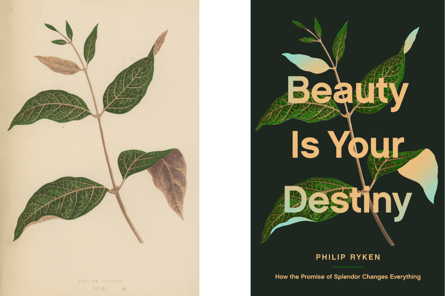
On the ‘Beauty Is Your Destiny’ cover:
TG: That’s one of those titles that you see on your schedule and it just gives you that extra boost of confidence. It’s funny how titles can be ironic, but you know this is one where they specifically said they want this to feel like a work of art or something that people would want to display. So that’s a tall order, and I guess that led me to Bridgeman Images because you guys have such a variety of beautiful and interesting art and this book is all about how beauty points us to God. Early in the process I just found myself looking at nature imagery and I ran across this image of leaves. It caught my attention and got me thinking about how I could play with it to express the title. I landed on this approach of showcasing something happening to the leaves where there’s something underneath - that beauty that speaks to something larger.
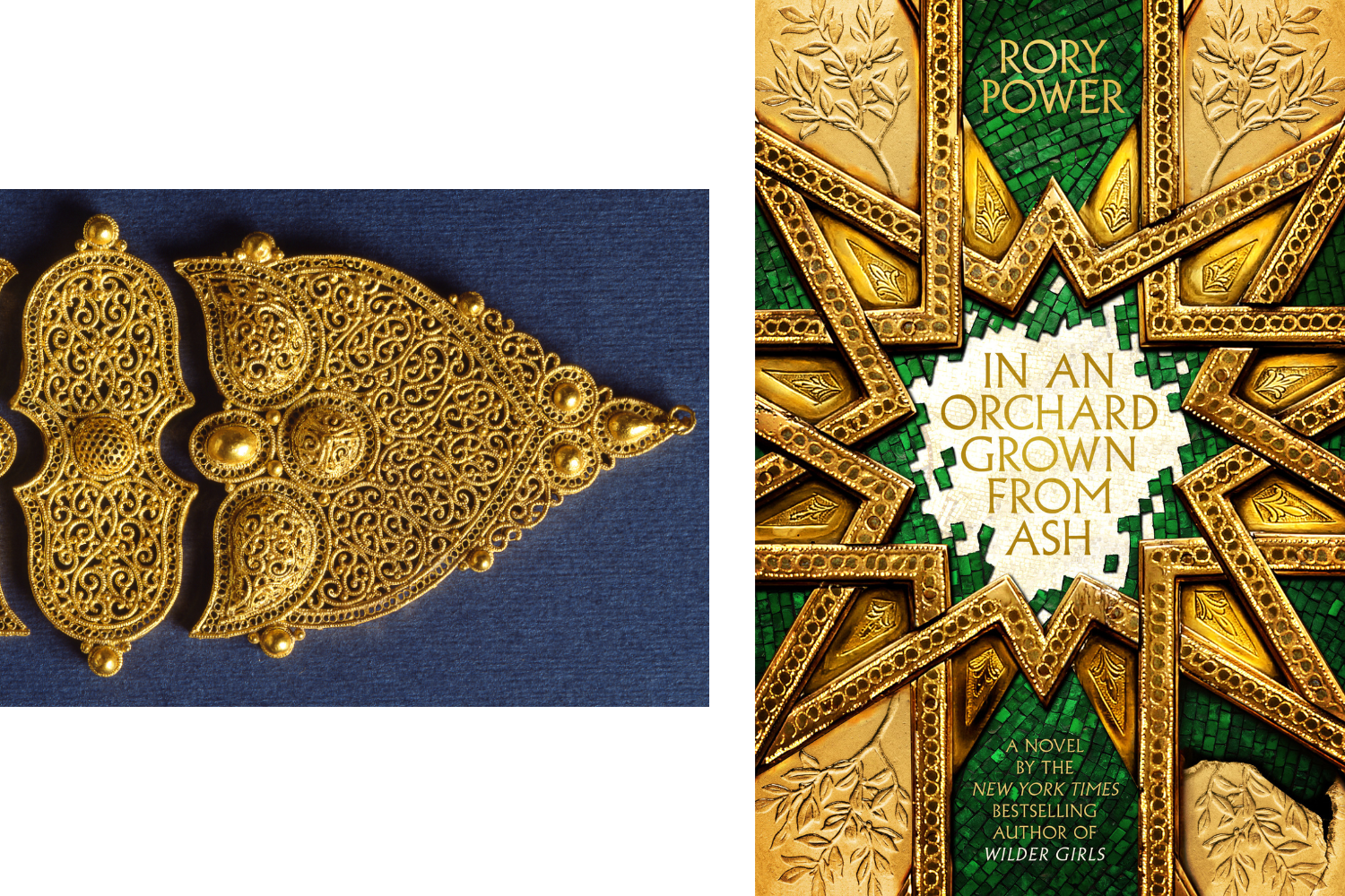
In An Orchard Grown From Ash; In A Garden Burning Gold:
These books are from a series by Rory Power and there’s this sort of Byzantine like background for the story where these semi immortal figures are holding sway. I love it when a cover is a little bit indirect and just captures your imagination in some way. With the images of gold you really feel that tactile quality of something ancient, something elevated in its artistry. I ran across on Bridgeman this beautiful image of a filigree gold treatment and that became the construct for creating the covers and that then set the stage for the series of books.
Sometimes imagery can completely line up with the historical period you’re trying to speak to but I just find that Bridgeman has such a wide array of artistic styles and source imagery. And often what I’m trying to do is source imagery or illustration and work them into something unique and fresh with the existing resources that I can round up. Bridgeman’s become a real help on projects like this. I want high quality imagery that can stand up to scrutiny with lots of elements woven together to create these looks, but you have to have that base resource to do it properly.
Also, props to Dave Stevenson at Penguin Random House for being a dream to work with on these.
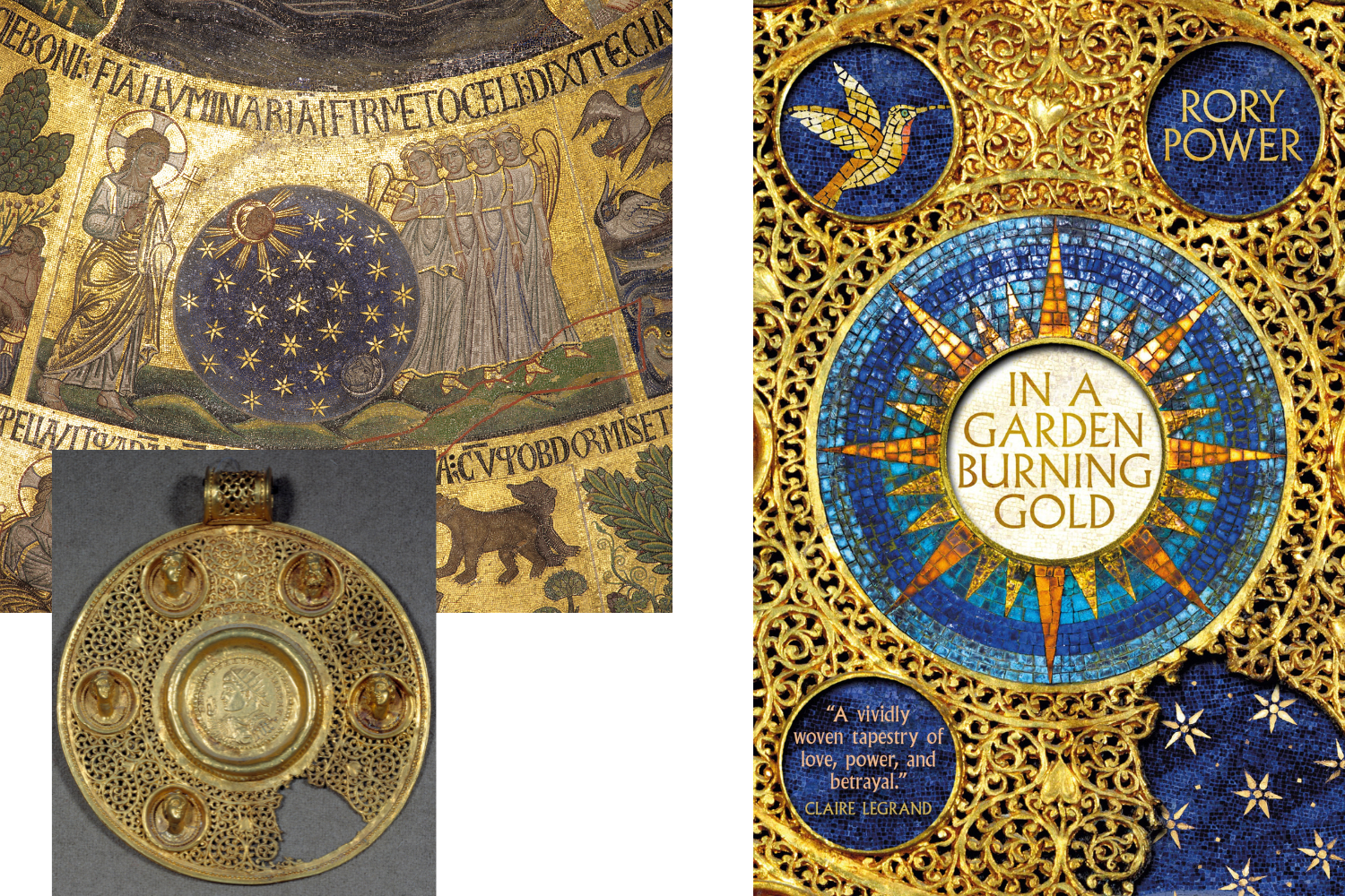
2. Gold circular medallion: solidus of Constantine I the Great (270-337 AD) strikes at Sirmium in 321 AD, in an opus interrasile frame, adorned with 5 relief busts. 4th century AD. Sun 0,092 m Paris, Musee du Louvre, Byzantine, (4th century) / Louvre, Paris, France / Photo © Photo Josse / Bridgeman Images
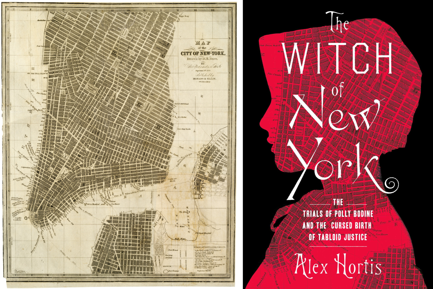
On the ‘Witch of New York’ cover:
TG: One of the things I love about this line of work is I’m always learning something new. Maybe it’s a little-known subject or one that I just hadn’t run across. In this case, it was the murder trial of Polly Bodine or ‘the Witch of Staten Island’ as she is known. Some kids were walking by and they saw this house on fire. It turns out that there’s a mother and child who were inside and had died but they were actually killed before the fire started. This was one of the early tabloid justice kind of circuses. I wanted to harken the 1840s time period and I ran across this map of New York from the time and just began playing around with it in different ways and I really loved how it combined with this silhouette.
There aren’t a lot of images available of Polly Bodine, just drawings from the trial. Using a silhouette of her made a lot of sense to keep some things to the imagination and then weaving in the map I just thought it was a little bit jarring and it spoke to the title. If you look closely in the bottom left of the map you can see Staten Island is one of the ferries listed and that was important to the author. I like how the map lays on the figure and gives a dimensional feel to the design. Sometimes I’ll have an idea and it's rarely a completely linear path where it’s like I have an idea and then I go through the motions and see it through and it ends up the way I expected. More often one idea leads to another and I find myself in a surprising, more interesting place and that cover tends to be more gratifying for the reader as well I think.
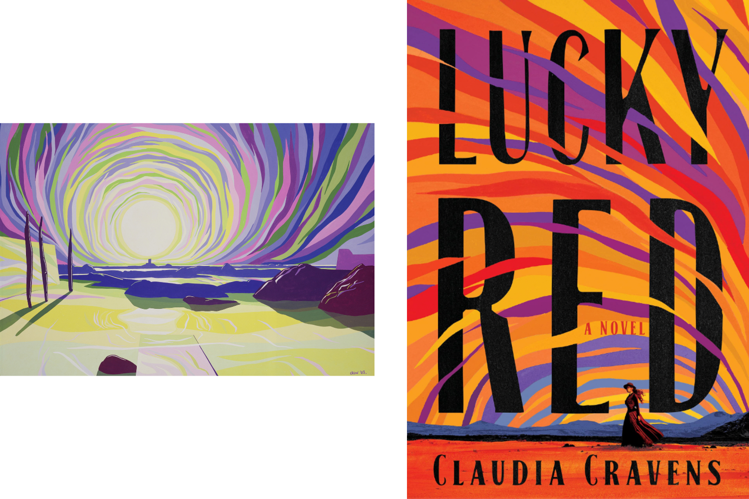
On the ‘Lucky Red’ cover:
TG: A really fun project and I worked with Michael Morris at Penguin on this one. The publisher wanted a look somewhere between photography and illustration. The story involves a 16 year old girl whose alcoholic dad dies on their way to Kansas and so she’s left on her own to fend for herself and ends up at a brothel and then falls in love with a gunslinger. It’s a sweeping story so I wanted to have this kind of confident, strong, independent look. In playing with this fusion of art and photography and trying to create a more graphic, artistic look I ran across this beautiful painting on Bridgeman and I thought that it would really make for an epic colorful sky. I just felt that traveling to Kansas makes you think of a wide open sky, adventures and a sense that everything and anything’s possible.
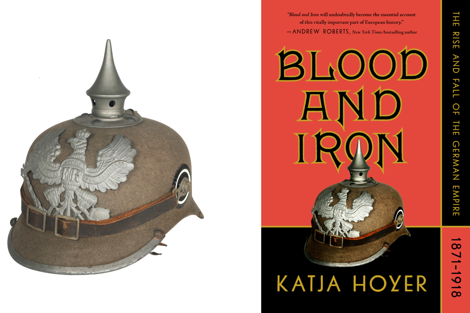
On the ‘Blood and Iron’ cover:
TG: This is a history of the German empire ending with the end of World War One and the challenge here is to express that time period in a vivid way and stray away from anything that might feel from a later period. Many people are more familiar with World War Two so capturing that earlier empire feel with the imagery really yielded some interesting results in looking around Bridgeman. The images used are two that stood out in different ways. The emblem of the empire becoming part of the title became the hero and then the soldier’s helmet brings a sense of the tactile physical reality.
.png)
How useful is Bridgeman as a resource in your day-to-day work?
TG: When I first started looking at Bridgeman I thought in terms of historical art but I soon discovered that it’s so much more. You know you go to look at a stock site and often what you get is that kind of humdrum stock imagery, sort of a yawn or stuff you’ve seen 1000 times. However, with Bridgeman there’s just such a variety and it’s fun to kind of geek out about the images. In some ways as a designer it can feel like you’re a casting director in that you are drawing upon a variety of resources with typography and color and imagery. Trying to bring all of these puzzle pieces together in a unique way to hopefully create something new that will get noticed and bring attention to the content that you’re trying to feature. I find Bridgeman is a very useful resource in that way because the work is quality and it is expressive and there’s such a wide variety that are works of art in their own right to draw upon. Many of the stock sources that I frequent elsewhere might not have that same level of artistry so it’s nice to have such a library of imagery - that’s pretty special.
Need help?
Can not find what you are looking for? Contact us. We are always more than happy to help you with your research, at no obligation or additional cost.
Finally, if you want to register or connect to our site, you will be able to access several additional tools, including being able to download images and videos faster.

